Every Colour Tells a Story
Behind every Farrow & Ball paint colour hides a tiny, fascinating story waiting to be discovered.
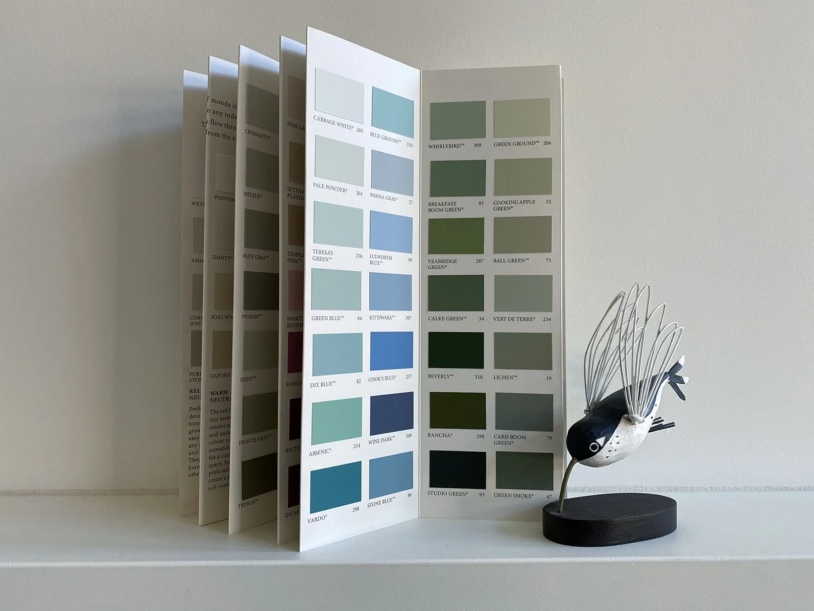
Farrow & Ball paint chart 2023
A Colour Chart
The other day, I picked up a paint swatch chart by Farrow & Ball. My youngest daughter said that we'd been living in our house for nearly three years now and nothing had changed in its interior decor. She's right by the way. Interior design is not my strong point.
I have a core selection of items that are moved from place to place, deposited where there might be a shelf or window sill or cupboard, clothes are put away (mostly), and chairs, tables, and sofas are situated wherever seems sensible and functional.
The only thing I have strong thoughts about is lighting. But then I am a photographer and the quality of light can border on an obsession.
To bring into our house a little freshness, love and care, I have been on a mission to try and 'decorate'. Hence the paint chart:
"Choosing colour should be an adventure, and often the best schemes are simply those you feel comfortable in. See what you're drawn to and think about how you want your space to feel."
Well, I don't know. It doesn't feel like an adventure although I do feel all at sea. Inevitably, looking at the paint chart, I become more interested in the story behind each colour name rather than the actual colours themselves.
Colours with the most striking names — Sulking Room Pink, Whirlybird, Eating Room Red and Elephant's Breath. There's a tiny story on the back of the chart describing the inspiration for the name of every colour.
Bamboozle
The name of this flame red hue was originally used to describe the deceit of pirates.
It seems no one can agree on the origins of bamboozle. There's a possibility it was simply made up and made its way into the English language by chance.
In An Emotional Dictionary by Susie Dent, the word is listed under bamboozled. There is agreement that the word appeared out of nowhere in the early 1700s, with author Jonathan Swift considering it to be 'dictated by fashion rather than sense' along with the words, 'banter', 'sham', 'mob', 'bubble', and 'bully'.
Further on, a few pages later, there is the entry bumfuzzled, meaning confused or bewildered. Dent tells us that the word was first recorded in 1878 in reference 'to one unfortunate J.M. Golden (Honorable), described as 'the worst bumfuzzled man in ten states'.
Which begs the question: Who was J.M. Golden and why was he bumfuzzled?
Cromarty
A muted green grey named after the Cromarty Firth estuary, a place of swirling mists, mentioned daily in the Shipping Forecast.
The Cromarty Firth estuary is a body of water located on the northeast coast of Scotland. It's where freshwater from the rivers and streams of Scotland flows down to mix with the saltwater of the North Sea. The mixing of saltwater and freshwater creates a unique environment that supports a huge variety of plants and animals that have adapted to live in these brackish water conditions.
But I’m interested in those swirling mists. All I can find is a photograph of mist hanging like a shroud over the Cromarty Bridge.
Dimpse
This cool grey is named after the West Country word dialect word for the colour of twilight.
A lovely word of Dorset (UK) origins, dimpse is also written as dimpsey and known as dumpsey all with a similar meaning to describe that low, dim light of twilight when the sun has dipped away and the night is drawing in.
India Yellow
This yellow is famously named after the pigment that was collected from the urine of cows fed on a diet of mango leaves.
Poor cows — with only a diet of mango leaves and water the cows became sick with dehydration and starvation. The sulphurous yellow pigment was exported from India in a 'no questions asked' world trade until the practice was eventually banned in the early 1900s.
You can read more about the history of India Yellow and its use in art in these articles:
The Murky History of the Colour Yellow
Mizzle
This soft green grey is named after West Country evening skies when there is a mix of both mist and drizzle.
Mizzle is such a great word, so efficient and descriptive. Just take two words, mist and drizzle, and make one when neither of them individually quite identify the weather.
However, Chat GPT (I know, I know) tells me that mizzle has its roots in the Old English word mýsle meaning to drizzle or fine rain. I’m also told the word mist comes from the Old English word misten meaning dimness or darkness.
What strikes me in all of this is how many words in Old English try to describe rain and gloom. And why could I only find this information through Chat GPT?
Sulking Room Pink
This muted rose is evocative of the colours used in boudoirs, a room originally after the French ‘bouder’ - to sulk.
How fascinating. A whole room to sulk in. Surely it’s possible to sulk in any room or outside if need be. But these were different times when if you were of a certain class there were rooms designed for every leisure activity. I wonder — if smartphones were available to the wealthy upper classes back in the 1700s, might there have been a room for TikTok? It’s a thought.
boudoir . noun
room where a lady may retire to be alone or to receive her intimate friends," 1777, from French boudoir (18c.), literally "pouting room," from bouder "to pout, sulk," which, like pout and bouffant, probably ultimately is imitative of puffing.
Wevet
A delicate white with a translucent, gossamer feel, this colour is named after the old Dorset term for a spider’s web.
Interestingly, I can't find any further references to the word wevet which is a shame because it is such a wonderful word. Let's bring it back.
Wine Dark
Inspired by midnight skies, this spiritual colour is named after the term Homer used to describe the sea, and is perfect to create an intimate space.
How's your Homer? Read The Iliad or The Odyssey recently? Me neither. Luckily there’s a wonderful blog called The Wine Dark Sea with a post asking the question of whether Homer was colour-blind. It’s a fascinating article about how the ancient Greeks perceived colour and whether — due to their minimal vocabulary for describing colour — they were all, in fact, colour-blind.
More likely, the ancient Greeks perceived colour in a very different way to us now. Colour was not described as a visual perception but as an emotion and in metaphorical form. For example, no word existed for the colour blue in Ancient Greece, which seems incredible to us now. If I type in the word Greece into Google and click on images, I can scroll through thousands of pictures of azure blue seas.
Homer describes the sea as ‘wine-dark’ following the tragedy of a shipwreck in The Odyssey and Achilles mourning the death of his friend in The Iliad. In both poems, wine-dark becomes the colour of grief and loss.
Bradley (Associate Professor of Ancient History at the University of Nottingham) takes a different view. The important point for him is that Homer describes the sea as wine-dark following a tragedy. Odysseus mourns the death of his men after a shipwreck, when they’ve been swallowed up by the wine-dark sea. Achilles mourns the death of Patroclus looking out on the wine-dark sea. ‘The idea is that the sea is dangerous, it’s captivating, it’s intoxicating, just like wine’, he says. ‘It’s much more than just the colour, it’s more about what the object-metaphor is encouraging us to think about’.
I don’t know about you but I’m thinking about colour differently now.